Create a toast notification package with SvelteKit
This article explains how to create a reusable toast library package for Svelte using SvelteKit. We will cover what a toast is, use Svelte Components and a Store to create one ourselves, and cover how SvelteKit can help us package the parts as an npm library.
If you only care about the code, have this REPL.
Requirements
You need to have a SvelteKit compatible JavaScript runtime like Node.js (>= 16) installed on your system.
#What are toasts?
By toasts, I mean notification-like floating text messages that display brief informational text for users without requiring action. They are sometimes also called by other names like Notifications in Carbon Design, Snackbars in Material Design or Alert in MUI.
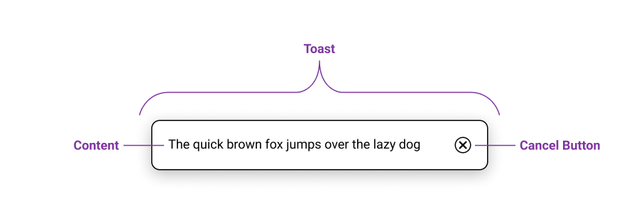
All of these have in common that they can display information to users without interrupting them, unlike a modal or dialog which require user interaction.
Toasts typically dismiss themselves after a timeout, but some versions also include a cancel button, so users can dismiss the toast themselves if they’re done with it.
#Package Goals
When creating a package, you should think about how someone would use it. The closest browser-native analog is probably the JavaScript alert(msg) method, but it isn’t exactly the same as a toast, because it blocks the user from interacting with the page until they have closed the alert window.
Displaying toasts should be as easy as creating native alert windows is.
So our package will export a function called addToast(mgs) that can be called to create a new toast.
We probably want to support different types of toast notifications, for example ‘info’ and ‘warn’ toasts. Toasts with the type ‘warn’ could be displayed on a red background to signify users that something went wrong, like failing to submit a form for example. Being able to set how long a toast stays visible could also be useful, for example if the text gets wider and you want the toast to be displayed for longer.
The usage of the package we will be creating could look like this:
<script>
	import { Toasts, addToast } from 'my-toast-lib'
	let value = 'Hello World'
</script>

<Toasts />

<input bind:value />
<button on:click="{() => {addToast(value)}}">Add as default info Toast</button>
<button on:click="{() => {addToast(value, 'warn', 8000)}}">
	Add as warning Toast that displays longer
</button>#Using SvelteKit to create packages
The one of coolest things about SvelteKit is the option to bundle your src/lib folder as an npm package in a snap.
Usually, you think of SvelteKit as an application framework, where the contents of the src/routes folder become the public facing pages of your application, and the src/lib folder is for shared code, i.e. an internal library.
But you can use svelte-kit package to reverse this paradigm: your src/lib folder becomes the public facing package and the src/routes could be used for testing, as a demo and for documentation.
We can also configure the packages entry point (or package root) using a src/lib/index.js file and SvelteKit even creates TypeScript definitions inside .d.ts files for you! You can read more about packaging libraries with SvelteKit in the Docs.
#Creating the package
To get started, create a new SvelteKit project by running this command:
npm init svelte@latest my-toast-libSelect “Library project” and then your preferred options. After the project is setup, install the dependencies using your package manager (e.g. npm i) and open the new folder in your code editor.
After this setup, we can get started with creating the toast package. We start by creating a couple of files inside the src/lib folder.
toastStore.js: this will create a store that holds all active toast notifications and exports functions to add and remove toasts.Toast.svelte: this will display a single toast notification.Toasts.svelte: this will read from the toastStore and display a list ofToastcomponents for every toast entry in the store.index.js: this will describe the root of the package entry point and allows for clean importing of library exports.
Note that you can also write .ts files if you opted into TypeScript at the initialization of the SvelteKit project.
#Creating a toast store
Inside the toastStore.js we will create a new writeable Svelte store to hold all of our active toast notifications.
I decided to use a store instead of context, because it allows for exporting a simple to use addToast function that edits this store.
We could also create a custom store to prevent the direct editing of the store, but for now I want to keep it as simple as possible.
So, to create a new writeable store for our toasts we import the writeable store from Svelte and create a new one with an initially empty array:
// src/lib/toastStore.js

import { writable } from 'svelte/store'

export const toasts = writable([])
Next up, we will create and export a new function that can be used to add a new toast. This function arguments include a message for the toast, a type of toast (defaulting to ‘info’), and number removeAfter which says how long the toast will be visible for (defaulting to 5000 ms).
Our toasts need some kind of identifier, so we can remove a specific toast for example. (We also want a unique key for our Svelte each block later on so we can add the flip animation!) For that we can use different approaches. We will use the
crypto.randomUUID()function for this.To now add the function arguments as a new toast to our store we call the
toasts.updatefunction. This function expects a callback function that takes the existing store value as its argument, and returns the new value to be set to the store. We return an array, which includes a new object with our generated id, the toast message, toast type and the number that controls how long the toast will be visible. We also spread the current value of the store inside this array, so all existing toasts will still be there after the update.Making the toast disappear after the time specified by
removeAfter, we callsetTimeoutand set a timeout for a call to a yet to be definedremoveToastfunction.We also want to return the id of our toast, so the developer using this function can get the unique identifier for the toast that was just created and remove it programmatically.
All in all, our addToast() function will look something like this:
// ... src/lib/toastStore.js

export function addToast(msg, type = 'info', removeAfter = 5000) {
	// 1. create unique identifier
	const id = crypto.randomUUID()

	// 2. add new toast using store.update
	toasts.update((all) => [
		{
			id,
			msg,
			type,
			removeAfter,
		},
		...all,
	])

	// 3. set timeout for the removal of the toast after some time
	setTimeout(() => {
		removeToast(id)
	}, removeAfter)

	// 4. return the unique identifier
	return id
}
Since we call removeToast, we need to define this function too. This function simply calls .update on the store, and filters the stores array value using the id that gets passed as an argument:
// ... src/lib/toastStore.js

export function removeToast(id) {
	toasts.update((all) => all.filter((toast) => toast.id !== id))
}#Creating a toast component
The Toast.svelte file will be our component that displays a single toast. We will use props to input a toast need to render our toast’s message and style it according to the type of toast that it is. We will also add a cancel Button.
Let’s start of with the <script> tag. Import the removeToast function from ./toastStore and use export to add a prop named toast, where our toast data will get passed down though. Lets also import the fade and fly transitions to add some flair later.
<!-- src/lib/Toast.svelte -->

<script>
	import { fade, fly } from 'svelte/transition'
	import { removeToast } from './toastStore'

	export let toast
</script>
Next up comes our HTML markup, where we will wrap our toast in a div with the class depending on toast.type. We also apply our transitions to this element.
Inside the div, we add a span with the status role to display our toast message. If we use {@html toast.msg} we can make our toast notification more flexible because we can add any html to the message.
Beside the span we place a button that calls our removeToast function we imported and passes in the id of the current toast we are displaying.
<!-- ... src/lib/Toast.svelte -->

<div class={toast.type} in:fly={{ y: -20 }} out:fade>
  <span role="status">
    {@html toast.msg}
  </span>
  <button on:click="{() => {removeToast(toast.id)}}">
    ❌
  </button>
</div>
Last up we will define our styles. We add some padding, margin, border-radius, and a box-shadow to our div and then we add some margin to our button. Now we define the types we want to support with our toast component. For now we just define text and background color styles for .info and .warn.
<!-- ... src/lib/Toast.svelte -->

<style>
	div {
		padding: 1.2em;
		margin-top: 1em;
		border-radius: 0.5em;
		box-shadow: 0 8px 16px hsla(0, 0%, 0%, 0.2);
	}

	button {
		margin: 0;
		margin-left: 2em;
	}

	.info {
		color: black;
		color: var(--toast-info-color, black);
		background: white;
		background: var(--toast-info-background, white);
	}

	.warn {
		color: black;
		color: var(--toast-warn-color, black);
		background: lightpink;
		background: var(--toast-warn-background, lightpink);
	}
</style>
Notice the CSS Custom Properties inside the rules for .info and .warn. This gives our component even more flexibility, because now the colors are theme-able from the outside and can even change dynamically to a dark theme for example. Here is how you would set CSS Custom Properties for components in Svelte using so called --style-props:
<Toasts --toast-info-color="white" --toast-info-background="midnightblue" />#Creating toasts list component
We can now store our toasts, add toasts, remove toasts and display a single toast, but we still need a Component that reads our store and renders a Toast component for every store entry. We do this inside the Toasts.svelte file.
Let’s start with the Script block again. We need to import the Toast component from ./Toast.svelte, then import the toast store from ./toastStore and let’s also import flip from svelte/animate for smooth list-item transitions. And thats about it. This component pretty much just plugs everything together, so no logic is needed inside the <script> tag.
<!-- src/lib/Toasts.svelte -->

<script>
	import { flip } from 'svelte/animate'
	import Toast from './Toast.svelte'
	import { toasts } from './toastStore'
</script>
We will wrap our entire markup section in a {#if $toasts.length} block, as to not render anything if there are no toasts in the store. Notice the $ in front of the store: this tells Svelte that you want to access the value of the store and let it take care of the subscription for you. Inside the if block we place a <ul> that will house all of our toast entries. Next we place a {#each $toasts as toast (toast.id)} block to render each of the toast entries. The part in parentheses at the end is our key, which helps Svelte track each toast entry and it’s associated markup. It is also required for our flip animation that we will add to our <li> element inside the each block. Inside the <li> you can finally place the Toast component and pass in the toast from the each block. The prop and the variable we want to pass in are called the same we can use the short syntax {toast}, which means the same as toast={toast}.
<!-- ... src/lib/Toasts.svelte -->

{#if $toasts.length}
<ul>
	{#each $toasts as toast (toast.id)}
	<li animate:flip>
		<Toast {toast} />
	</li>
	{/each}
</ul>
{/if}
Last up is the CSS that lets us display the toast on top of everything else on the page. We select our ul, remove the list styling, center the content and position it fixed it to the bottom of the screen.
<!-- ... src/lib/Toasts.svelte -->

<style>
	ul {
		list-style: none;
		display: flex;
		flex-direction: column;
		align-items: center;
		width: 100%;
		position: fixed;
		bottom: 1em;
	}
</style>#Packaging it all up
One thing we still need to code is our index.js file which describes the top level package entry point. We want to make the Toasts component and the addToast function from our toastStores.js file available.
// src/lib/index.js
export { default as Toasts } from './Toasts.svelte'
export { addToast } from './toastStore'
We are pretty much done with the library. Let’s first give it a spin to check if everything works like we want to.
Open up src/routes/+page.svelte and replace it’s contents with the an example usage of our package. Notice here that we import from $lib to import files from our src/lib folder.
<!-- src/routes/+page.svelte -->
<script>
	import { Toasts, addToast } from '$lib/'
</script>

<Toasts />

<button on:click="{() => {addToast('hi')}}">Toast "Hi"</button>
Next up, lets open the development server and open that up in our default browser:
npm run dev -- --openThe SvelteKit App should load and you should be able to click the Button to spawn a toast. If it doesn’t work then check out the Terminal or Browser Dev Console to spot errors.
Finally, the last step is to run that new npm package script and SvelteKit will build our package inside the package folder:
npm run packageTo publish your package, simply run npm publish. For more details check the npm docs on publishing packages.