Introduction to Web Components
#Table Of Contents
#1 Introduction
The field of web development is constantly changing. Methods and technologies are constantly being rethought and innovated. Dynamic websites, for example, can be written as server-side applications in PHP or Ruby on Rails that render HTML documents. These documents are then generated on demand and sent to the client. However, websites based on these technologies are very static due to the exclusively server-side approach and have to load a completely new HTML document from the server for a page change, for example [Moving from Server-Side to Client-Side Web Development]. However, Single Page Application (SPA) frameworks use client-side JavaScript to enable fully dynamic and multi-page web applications. These frameworks are gaining popularity, which can be seen in the download numbers of these frameworks on npm (set “Downloads in past” to All time).
According to the Stack Overflow Developer Survey, JavaScript has been the most popular programming language since at least 2013. In addition, the web can cover more and more functionality of native smartphone apps. Push notifications, camera and microphone permissions, offline modes, and background synchronization are among the functions that used to be available only to native smartphone apps, but can now be implemented with web technologies. The website whatwebcando.today provides a list of smartphone features, with an indication of whether they can be accessed via Web APIs.
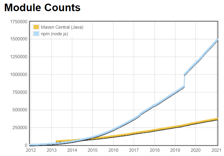
Modulecounts.com shows that npm, with about 1,491,097 different packages compared to other package registries for other programming languages, offers far more packages, and thus allows for numerous different approaches to implementing features. Second place would be Maven, the common package manager for Java, with 373,177 packages [the numbers are from the 2021-01-09 and will have changed by now].
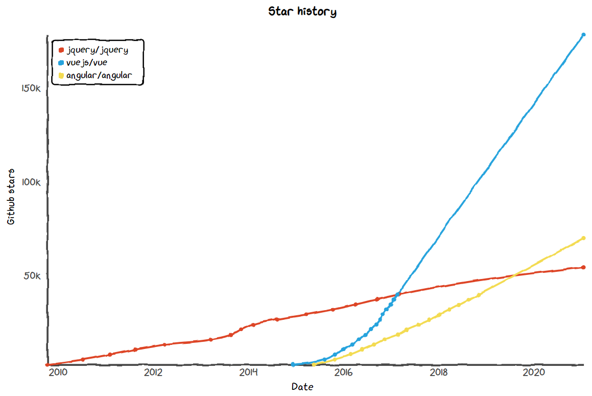
The website Star-History.t9t.to shows the history of GitHub Stars in a graph. GitHub Stars are usually distributed by developers to repositories that are of interest to them. From the graph, you can see that emerging technologies with innovative approaches gain popularity very quickly. For example, if you look at the vuejs/vue repository, it has seen a stronger growth since around the beginning of 2017 compared to angular/angular. However, if you look at the graph of jquery/jquery, you can also see that older technologies are not being completely replaced because, for example, older projects continue to be maintained with this technology, and a complete technology change would entail high costs.
However, this diversity and constant innovation can also be a problem for developers: The high number of different approaches can be overwhelming and developers wonder if it’s worth it to rely on new technologies if they become obsolete again after an unspecified amount of time. In addition, the various SPA frameworks offer little or no opportunity to reuse code already written in other frameworks. More on this in chapter 1.1.
This paper aims to clarify how Web Components help in the development of web applications and to what extent they can replace SPA frameworks or their components. For this purpose, the terms component and Web Components are explained below. Within chapter 2, Web Components are distinguished from SPA frameworks and examined in more detail how Web Components can be implemented by browser APIs. Furthermore, the current support of browsers and popular SPA frameworks is discussed and the disadvantages of Web Components are discussed. In the last chapter the elaboration is summarized and a conclusion is drawn.
#1.1 Components
When developing web applications, one inevitably also creates a graphical user interface, which is displayed by the browser. In order to handle the different elements of the user interaction uniformly, the concept of the component has been established.
A component is the isolation of the smallest possible part of an application. Buttons, cards, dropdown menus, loading spinners and many other elements can be designed and implemented independently of each other. These individual parts can then be used multiple times and combined with other individual parts to form entire web pages. You can think of it like a box of LEGO blocks: Each block stands alone, but can also be combined with other blocks in various ways to lead to different constructions. When placed in a web application, components can be filled with different content through attributes or the content between the tags. In addition, components can communicate with the outside world and with higher-level components through events.
Components are also an important part of Design Systems. Design Systems are a modern approach to product development and include interconnected design patterns and agreed upon practices. Colors to be used, typography, patterns, visual style, layouts, animations and much more are sorted in a central place to help different teams design and develop applications. Components are also defined here, and it is usually determined for which case which component is to be used.
An example of a design system is Material Design by Google, which lists components as well as a comprehensive list of design basics.
For the code, this means that the structure, appearance and logic for a component only need to be maintained in one central location. The component can then be reused in various places, which corresponds to the “Don’t Repeat Yourself” principle of software development. The goal of components is therefore to reuse code in a modular way. If a developer wants to change something on a button, the developer changes the corresponding button component.
The SPA frameworks mentioned earlier, such as React, Angular, or Vue, use the concept of components in order to be able to break down code into modules accordingly. With these frameworks, reusable, encapsulated components can be created. However, the components can only be used with the framework with which they were created. The source code of these components uses framework-specific dependencies and abstractions, such as classes, functions and decorators, to enable a modular component structure. Through these specific abstractions, frameworks provide an opinionated structure for how components should be defined and how they can be used.
#1.2 Web Components
This is where Web Components come into play: The term Web Components refers to a standardized component model for the open web. The goal of Web Components is to provide a standardized way to define and use components independently of frameworks. This gives developers more flexibility, as they can implement Web Components independently of the frameworks used and existing applications, and in future will not be bound to a particular framework for the implementation of an application.
Web Components therefore offer the possibility of defining components once and reusing them frequently, even across different projects with different frontend technologies. The structure, logic and appearance of the component then only have to be maintained in one central location instead of being implemented again in each project. This also makes it easy to update components, as they only need to be changed in one place to be updated in multiple places.
Web Components are not a standard in themselves, but are the union of several living standards that together enable the creation of Web Components. The most important standards for Web Components are Custom Elements, Shadow DOM and HTML Templates.
Custom Elements allow you to create and use new full-fledged DOM elements. With Shadow DOM, an encapsulated DOM tree can be used to create isolated components that are not externally influenceable. HTML templates can be used to create markup fragments, clone them, and fill them with content. In chapter 2, the individual specifications are examined in more detail.
The WebComponents.org website contains a lot of helpful information about Web Components such as a “Getting started” guide and a blog with articles from the community. There is also an index of Web Components that are ready to use.
#1.3 Use Web Components
Since Web Components use standardized specifications, they can be easily implemented in existing or new web applications. Ready-made Web Components only need to be imported via JavaScript and can then be used in HTML by using the Custom Element Tag. To illustrate the process, the package @polymer/paper-button is used as an example. PolymerElements’ paper-button is an implementation of the button from Google’s Material Design System as a Web Component. The button has its own appearance and animations according to the Material Design specifications. To use the paper-button, it can be installed via the npm package manager. To do this, execute the following command in a CLI with access to npm:
npm install --save @polymer/paper-buttonOnce the installation is complete, the paper-button can be imported via a script tag in the HTML document:
<script type="module">
  import '@polymer/paper-button/paper-button.js'
</script>
Now the paper-button is available in the HTML document via the custom paper-button tag is available. This can now be placed in the HTML by setting the tag. Between the Tags it is possible to set a button label:
<paper-button raised>fancy new paper-button</paper-button>The raised attribute can be used to give the button a shadow. To test the button, a local development server can be started with npx snowpack dev.
In this figure a regular HTML button is compared with the above imported and placed paper-button. From the appearance of the paper-button it can be seen that these component has supplied its own CSS styles. However, these do not affect the regular HTML button. In addition, the paper-button has its own animation, which is called when the button is clicked.
In this example npm was used as package manager and Snowpack as build tool. In principle, it is also possible to use external web components without a package manager and bundler. However, the component must be packaged in such a way that it can be interpreted directly by the browser. The specifications that enable Web Components are used in the browser using JavaScript, which is why you can also define a Web Component in a regular HTML or JavaScript file. However, this is not possible with the @polymer/paper-button because the paper-button.js file requires other npm packages that are not automatically resolved and bundled via a CDN service like unpkg.com. In the later course of this article, a component will be developed that can be used without npm and bundler.
#2 Web Components in Detail
In this chapter, Web Components are distinguished from SPA frameworks and the corresponding specifications are explained in detail. In addition, a component with the Web Component specifications is implemented in the course of the chapter.
It is also important to mention that the various Web Component Specifications are defined as living standards. This means that they are constantly evolving along with the other web standards. In this paper I refer to the status in December 2020. Under the GitHub repository of the W3C you can find a list of the different Web Component APIs with links to the respective specifications.
#2.1 Differentiation of Web Components
In order to clarify the classification of Web Components, the term Web Components is now distinguished from SPA frameworks such as Angular, React or Vue. These frameworks offer a variety of functions that simplify web development. Among other things, data binding (linking JavaScript data with HTML elements), routing (creating routes that represent different parts of applications) and templating (creating markup fragments). In addition, each framework has an ecosystem of extensions that can be optionally added. Most frameworks use their own component models to enable the use of framework-specific components. In itself, components written in one framework cannot be used with another framework without further ado.
Web Components, on the other hand, are a method for defining standardized, reusable native components. The specifications that make Web Components possible are primarily concerned with creating custom HTML elements, logically encapsulating DOM structures, and templating. Web Components do not deal with other features such as data binding or routing that you are used to in frameworks. Since Web Components are a standardized component model, they can basically be used with all modern browsers and frameworks.
It is also possible to package framework components as Web Components. This will be discussed in more detail in chapter 2.6.
#2.2 Custom Elements
It has already been shown when using a ready-made component that web components can be placed in the HTML document using their own tags. To create your own tag the Custom Elements specification can be used. This specification is part of the “HTML Living Standard” which is maintained by the Web Hypertext Application Technology Working Group (WHATWG). The Custom Elements API allows the creation of custom full-featured DOM elements or HTML tags. Theoretically, the use of non-standard HTML tags was always possible, but this was more a consequence of the “forgiving” way HTML is rendered in the browser and never standardized. By creating a custom HTML tag, the Custom Elements specification gives us the ability to use the HTML tag as the entry point for our component.
Custom Elements consist of a JavaScript class that inherits from the HTMLElement class. This
class must also have a constructor() {...} with a super() call in the first line to get the correct
prototype chain and this value before any further code can be executed. Then, to give the class a
visible content, we can assign this.innerHTML to any value. To illustrate the specification, the
following defines a custom element with the tag <my-button>. Initially, the class of MyButton looks
like this:
class MyButton extends HTMLElement {
  constructor() {
    super()
    this.innerHTML = `<button>my-button</button>`
  }
}
After the custom element class has been created, it must be registered for the browser. This is done by calling the function window.customElements.define(…), where the first parameter is a string with the name of the custom HTML tag and the second parameter is the class created above. It is important to note that the HTML tag can only be registered if the same string has not already been used. So if another package already uses the tag string “my-button”, the …define(‘my-button’, …) call will fail. Also, the tag string must contain at least one hyphen and be lowercase (kebab-case). The exact specifications for valid custom element tag names can be found in the HTML standard7. For our example, we call the function as follows:
window.customElements.define('my-button', MyButton)Since the custom element is now registered with the browser, the custom HTML tag can be used in the HTML document:
<my-button>my new fancy button</my-button>The now newly defined my-button custom element is a so-called “autonomous custom element”. This means that this element has only inherited the HTMLElement class and does not inherit any other properties. It is also possible to inherit other HTML classes, for example the class HTMLButtonElement. Here, when registering the class, an additional third parameter must be an object with the key extends and the value must be the inheriting tag. Example:
window.customElements.define('plastic-button', PlasticButton, {
  extends: 'button'
})
Custom elements also offer the possibility to define different lifecycle hooks. The constructor() {...} block is called, for example, when the element has been initialized or upgraded. In the context
of custom elements, an upgrade means that an element used in HTML before registration is
promoted from an undefined element to a custom element at the time of re-registration. In the
constructor(), initialization steps can be performed. In the my-button example, the constructor() was
used to define a content.
To perform certain initialization steps that require the element to already be hooked into the DOM,
the connectedCallback() {...} block can be used. This lifecycle hook is executed when the element is
linked to the DOM. In contrast, there is also the disconnectedCallback() {...} block, which is executed
when the element is detached from the DOM. There could be logic here to clean up the component.
Another interesting block is attributeChangedCallback() {...}, which is executed when an attribute
has changed.
#2.3 ShadowDOM
Now that the my-button is implemented, and the markup is defined in the constructor() by
assigning this.innerHTML, it would be conceivable to mark up the button with CSS by adding a
style tag. This is also possible, but the style tag inside the innerHTML parameter affects the whole
HTML document, because there is currently only a global CSS scope. This can be worked around
by using IDs or classes, but the classes or IDs would have to be very specific so as not to affect
possible other components that use the same classes or IDs.
With the Shadow DOM API it is possible to encapsulate the DOM tree of the component from the rest of the DOM. The Shadow DOM specification is part of the DOM standard, which is also maintained by the WHATWG. So-called shadow roots can be created, which can then be attached to an existing DOM tree via a shadow host. The trees are logically encapsulated and cannot influence each other. The following graphic explains the structure of a DOM tree with an attached shadow root.
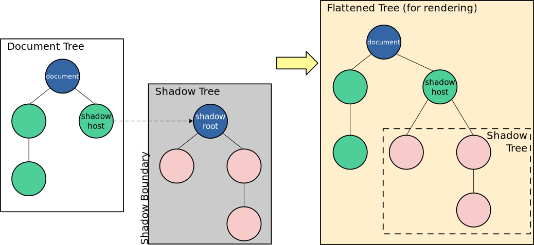 Image from MDN
In the DOM tree, a shadow root, and thus a second so-called shadow tree, is inserted via the shadow host. These are logically separated from each other by the shadow boundary and cannot influence each other. The browser flattens the two DOM trees into one DOM tree so that the tree can be rendered. However, the shadow tree remains logically encapsulated. This keeps the structure, style, and behavior of the component isolated and separate from other elements. This allows you to create CSS rules that apply only to the component, without using specific classes or IDs that complicate the code.
To create a shadow root for a component, this.attachShadow(...) can be called in the component
class. As the first parameter, an object with a key mode and the corresponding value "open" should
be passed so that the shadow root can later be accessed via JavaScript. This is needed here to
insert our markup into the shadow root.
To define the markup, a new constant called markup can be created. This constant is assigned
the value document.createElement("div"), which creates a new HTMLDivElement. Then we can
use markup.innerHTML to specify the content of our component. This is then inserted into the
shadow root by this.shadowRoot.appendChild(markup).
Since the structure is now defined by the shadow root, any CSS rules can now be created without
affecting the rest of the document. For example, you could create the following additional block inside
markup.innerHTML:
<style>
  button {
    color: #5c8012;
    background-color: white;
    /* ... more styles... */
  }
</style>Although the generic button CSS selector is used here, these CSS rules only affect our
component, thanks to the shadow root. Additionally, style rules set in the source document do not
apply to our shadow root. For example, if the generic button CSS selector was used to give all
buttons on the page a red border, the rule will not affect our my-button component due to
encapsulation by Shadow DOM.
#2.4 HTMLtemplates
Now we have a MyButton component class that defines a button that is encapsulated and can be
styled by generic CSS selectors without changing any other elements. But now the structure, look
and logic of the component is defined within the constructor(). There is no logical separation of concerns
here. And what if the same structure might be needed in another place?
Using the HTML Template specification, document fragments can be defined, cloned, and deployed. This specification is also part of the HTML standard maintained by WHATWG. In addition, HTML templates can be dy-namically populated with content using elements.
So to better structure our component, instead of defining the structure inside the class, we create
a template constant above the class and assign it to the document.createElement('template') value.
This creates a new HTMLTemplateElement. Our markup is now assigned to the innerHTML
parameter of the template constant.
To use the template, the content must be explicitly cloned. This can be done within the constructor() block as follows:
this.shadowRoot.appendChild(template.content.cloneNode(true))This line clones the content of the template element and puts it in the shadow root. This keeps the class lean and separates the structure and appearance from the logic in the code, which makes for better maintainability.
If my-button is now used as above by using the custom element, a
Developers expect you to set a label as follows:
<my-button>my new fancy button</my-button>However, only the label “my-button” is displayed in the browser. With a regular HTML Button a
button label can be set by the content between the tags, which is displayed on the button. The mybutton currently only has a fixed label (“my-button”) which is defined by the template. To set a button
label dynamically, an HTMLSlotElement can be used. A <slot/> element can hold the content
between the <my-button> ... </my-button> tags. So if we use a slot element within the template instead of a fixed value, the label
can be defined by the content of the my-button tags like a regular button.
#2.5 HTMLImport / ES Modules
The HTML Import specification was a planned packaging mechanism for Web Components, but it can also be used on its own. It was planned that HTML files can be linked into another HTML file by the following syntax:
<link rel="import" href="imported.html" />Chrome, however, has discarded this feature since version 73 and Firefox has never supported it. A blog post by Willson Page explains that HTML imports were not supported because they were waiting for ES Modules.
ES Modules are a standardized syntax for importing external assets in JavaScript, which can also be used to export and import Web Components as modules and have become more popular than HTML import.
#2.6 Libraries for creating Web Components
The native API of the specifications are a good starting point for enabling Web Components, but do not offer features that developers are used to from frameworks (as already discussed in chapter 2.1). In the meantime, there are a large number of libraries that want to support the developer when creating Web Components.
In a blog post on the Webcomponents.dev page, several libraries for creating Web Components are presented. Code snippets, bundle sizes and performance are listed for each library discussed. In the following, the library Svelte will be considered in more detail, since it ranks third in the bundle size of a component and fourth in performance. Thus, this library is the only one (besides the regular HTMLElement, i.e. the method discussed above) in the top 5 in both categories. (Note: This was written in late 2020. Prism is currently above Svelte in both bundle size and performance. That said Prism was just an experimental Project that will no longer be developed, according to its GitHub Description.)
Svelte differs from other SPA frameworks like Angular, Vue and React in that it is a compiler that builds the components, producing the most efficient JavaScript possible. Angular, Vue and React require the entire framework to be loaded in the browser, whereas Svelte does not by virtue of the build step. The advantages are also smaller bundle sizes and better performance, since no matching with a Virtual DOM is needed. Also, the Svelte compiler allows its own syntax, which leads to simpler code.
With the customElement option of the Svelte Complier a Web Component compliant output can
be generated, whereby Svelte components can be used in other frameworks, or completely without
a framework. Other frameworks also offer the possibility to build framework components as web
components, but here the whole framework is embedded to make the component work.
Unlike React, Svelte does not use JSX, but its own syntax based on HTML. Template markup
can simply be written directly into a *.svelte file as if it were a *.html file. Similarly, CSS rules can be
written into a <style> ... </style> block and JavaScript logic into a <script> ... </script> block. To
create a variant of the MyButton in Svelte, you only need to copy the contents of the template from
the example, since the Svelte syntax is based on HTML.
To give Svelte components custom element compatible tags the Svelte specific special element
<svelte:options tag="my-svelte-button"/> is used. Now a component developer can save the boilerplate around custom element classes, shadow root
attachment and HTML templates and get a number of helpful features without embedding an entire
framework within the Web Component.
To illustrate once again how these advantages work, the my-button is copied and extended into a my-counter component. The my-counter should consist of a button that displays a count variable as a label. When the button is clicked, the count should be incremented. In addition, the count should be able to be set externally by an attribute:
<my-counter count="30"></my-counter>To implement the my-counter, the following steps must be taken in the case of native
implementation:
- In the HTML template, replace the slot element with an initial value.
- Below the
constructor()block, aconnectedCallback()block is created. This adds an EventListener to the button, which increments our Count variable when the button is clicked. - Additionally, the
connectedCallback()block checks if thecountattribute is set, if not it is initially set to 0. - Since an EventListener was added, it must be removed again in a
dis
connectedCallback()block. - To tell the browser which attributes to observe when modifying, a static get
observedAttributes()block must be added, which holds an array of attributes to observe. - To update the count in the template, the
attributeChangedCallback()block is added which updates the span element from the template. - To connect the internal count variable
this.countwith the count attribute (which can be set externally), a getter and setter must be written for count.
The native implementation of the my-counter component requires 68 lines and 1454 characters
of JavaScript. In contrast, only the following steps are needed to implement my-counter in Svelte:
- A
<script>...</script>block is added, which initializes a count variable (let count = 0;) and implements a function to increment it. - In the button element of the
.sveltefile, the slot element is replaced by{count}. - The increment function is added to the button as a click event listener by adding
on:click={inc}as an attribute. - In order for the internal
countvariable to be set externally via acountattribute, theexportkeyword must be placed in front of the variable declaration.
The native implementation of the my-counter component in Svelte requires 36 lines and 631
characters. Only about 43% of the characters are needed. This makes the code more readable
and easier to maintain. The source code of the JavaScript and Svelte implementation of my-counter can be found at the end of this article and on the GitHub repository SarcevicAntonio/si-web-components/tree/seminar-informatik.
#2.7 Browser support
In order to use Web Components, end user browsers must support the various standards. According to the browser support table at Webcomponents.org (scroll down a bit), all common modern browsers (Chrome, Opera, Safari, Firefox, Edge) have “stable” support for the required specifications.
Detailed information on the support of other browsers can be found at CanIUse.com. For example, Safari does not support customized build-in elements and since Internet Explorer is no longer being developed, support for custom elements, Shadow DOM or HTML templates is completely missing.
In case an end user is using an older browser that does not support the Web Components standards (e.g. Internet Explorer 11 or outdated versions of Chrome), so-called polyfills have to be loaded. Polyfills are JavaScript packages that emulate certain APIs in older browsers. Webcomponents.org offers Web Component Polyfills that make it possible to use Web Components in older browsers.
#2.8 Frameworks support
To check the compatibility of Web Components with different frameworks, the project “Custom Elements Everywhere” was launched. On the website of Custom Elements Everywhere you can find a list of different JavaScript frontend frameworks with an evaluation and corresponding GitHub issues, if any. For each of the frameworks, 30 different tests were written, which cover different functionalities of web components.
Looking at the popular modern frameworks, it is noticeable that Angular and Vue pass all tests and thus receive a score of 100%. Svelte also achieves a score of 100%. React, on the other hand, has problems passing objects as parameters and interacting with native DOM events because it uses its own event system. As a result, React only achieves a score of 70%.
A framework with good Web Component support is desirable, since Web Components can be used to build framework agnostic components and design systems. This has the advantage that components only have to be defined once and can be used in different frameworks if they support Web Components well.
#2.9 Disadvantages of Web Components
Web Components provide a basis for creating framework agnostic components by using
JavaScript APIs. However, this is also a major disadvantage of Web Components. Search engine
crawlers usually do not use JavaScript, but (mostly) only parse the index.html file that the server delivers. If
important information is nested within Web Components, it is not analyzed because the component
is defined by JavaScript. This problem also plagues SPAs, since they also use JavaScript to
dynamically fill the page with content. Different strategies like Serverside Rendering and Static Site
Generation have been developed, which pass a pre-rendered HTML page to the client, so that the
user or crawler can still find content when the page is initially loaded and JavaScript is disabled.
The @skatejs/ssr package can be used to pre-render even Shadow DOM implementations
server-side, but this still requires JavaScript on the server.
A declarative way to use Shadow DOM in HTML is currently under discussion, which would make encapsulation of structure and style
no longer dependent on JavaScript availability.
By encapsulating using Shadow DOM, all styles that are used in a Shadow DOM are defined within style elements for each shadow root. There is no mechanism to modularize styles across different components. Constructable stylesheet objects are discussed to define stylesheets as objects in JavaScript, import them and apply them to shadow roots. This allows different components of the same design system to share a stylesheet.
In addition, there is no concept of namespaces with respect to custom element tags. Developers have to think about a unique prefix for tags in order to avoid conflicts with other custom element tags. For this purpose, the concept of Scoped CustomElementRegsitry is discussed , which allows to use different custom element definitions with the same tag name.
#3 Summary and conclusion
The Introduction chapter introduced the concept of components and explained the basics of Web Components: components are the smallest possible parts of Web applications that can be reused, while Web Components are a standardized model for creating components. Web Components enable the framework to work agnostically with pre-built components and are an important consideration for Design Systems because they enable stack independent implementation. In addition, Web Component-based components can be changed more easily because they only need to be changed in one place.
In chapter 1 Web Components were distinguished from Frameworks and the most important specifications for the creation of Web Components were explained and used. Custom Elements allow the creation of own HTML elements, Shadow DOM allows the encapsulation of HTML elements and HTML templates can be used to define document fragments. Furthermore, the library Svelte was introduced and its use in relation to Web Components was explained. This was followed by an overview of browser and framework compatibility. Subsequently, the disadvantages of Web Components and the currently discussed solutions were explained.
In conclusion, Web Components allow for encapsulated UI sub-elements that can be placed as HTML tags on an existing page and function without conflicts with other elements and styles on the page. Unlike SPA frameworks, the various specifications serve as a kind of standardized “lowerlevel-api” that allows for encapsulated and reusable components and thus modularity in the frontend. This API can be used as a target by compilers like Svelte to simplify the development of Web Components with abstractions and features like data binding. However, Web Components are not an SPA framework replacement, as already discussed in chapter 2.1.
Generic UI elements can be implemented well as Web Components to create a future-proof code base. However, it is easier to implement more complex, data-dependent and application-specific components with frameworks, since the available features such as data binding and dependency injection are very helpful.
#My Counter Web Component Code
#my-counter.js (Vanilla Web Component)
const counterTemplate = document.createElement('template')
counterTemplate.innerHTML = `
<style>
button {
  display: inline-block;
  color: #5c8012;
  font-size: 18px;
  font-weight: 500;
  font-family: "Futura";
  background-color: white;
  border: 1px solid grey;
  border-radius: 4px;
  padding: 8px;
  margin: 8px;
  transition: box-shadow .4s ease;
  user-select: none;
}
button:hover {
  box-shadow: 0 4px 32px 0 rgba(0,0,0,.161);
}
button:active {
  background-color: grey;
  color: #9ed137;
}
</style>
<button id="inc">
  Clicked <span id="count">0</span> times
</button>`
class MyCounter extends HTMLElement {
  constructor() {
    super()
    this.attachShadow({ mode: 'open' })
    this.shadowRoot.appendChild(counterTemplate.content.cloneNode(true))
    this.handleClick = () => {
      this.count++
    }
  }
  connectedCallback() {
    this.shadowRoot.getElementById('inc').addEventListener('click', this.handleClick)
    if (!this.hasAttribute('count')) {
      this.setAttribute('count', 0)
    }
  }
  disconnectedCallback() {
    this.shadowRoot.getElementById('inc').removeEventListener('click', this.handleClick)
  }
  static get observedAttributes() {
    return ['count']
  }
  attributeChangedCallback(name, oldCount, newCount) {
    this.shadowRoot.getElementById('count').innerHTML = newCount
  }
  get count() {
    return this.getAttribute('count')
  }
  set count(newCount) {
    this.setAttribute('count', newCount)
  }
}
window.customElements.define('my-counter', MyCounter)#MyCounter.svelte (Svelte w/ customElement option)
<svelte:options tag="my-svelte-counter" />
<script>
  export let count = 0
  function inc() {
    count++
  }
</script>
<button on:click="{inc}">Clicked {count} times</button>
<style>
  button {
    display: inline-block;
    color: #5c8012;
    font-size: 18px;
    font-weight: 500;
    font-family: 'Futura';
    background-color: white;
    border: 1px solid grey;
    border-radius: 4px;
    padding: 8px;
    margin: 8px;
    transition: box-shadow 0.4s ease;
    user-select: none;
  }
  button:hover {
    box-shadow: 0 4px 32px 0 rgba(0, 0, 0, 0.161);
  }
  button:active {
    background-color: grey;
    color: #9ed137;
  }
</style>